UX DESIGN
MediaBulb Mobile App
Music thoughtfully picked for you.
Project Overview
In this media product scenario, I was tasked with designing an experience that allows new and current users to subscribe and pay a monthly fee for a premium membership. As the MediaBulb company began to gain a healthy user base, the company wanted to evolve the feature set of their product to be able to monetize on a premium product. After analyzing competitors and conducting user interviews, I was able to create an experience that provided an opportunity for current and new users to subscribe to our premium product. Offering a one month free trial would give users the opportunity and “compel” users to engage with the product.
Problem
Solution
User Research
MediaBulb offers a free media subscription with access to millions of songs and podcasts. As of now, the product lacks a call-to-action upon registration for users to have the opportunity to sign up for premium. It also lacks the features that users are looking for in a paid media product. Multiple users expressed ads as a pain point in the user experience. Offers of free premium trials seemed to be a consistent tactic in getting users on-board to see what the paid product has to offer.
As a budget-friendly consumer, I understand the desire of having a cost-effective product that provides unlimited access to music at an affordable price. With the offer of premium features, it should be fairly easy for users to subscribe, but also provide an opportunity for users to test-drive the product to engage with what premium has to offer. My current subscriptions all came with a free trial, and that definitely influenced my decision to subscribe.
After conducting user interviews and synthesizing the research, I was able to add a call-to-action feature to the login/sign-up flow and offer a free trial period to engage users in experiencing the premium product. Users will be able to compare the free and premium features. This will save users time in comparing products. No need to enter in personal information, users can use their Apple ID to complete their subscription. Users gave positive feedback during the testing process. The interface was fairly easy to navigate, and users made note of how this product catered to users on a budget with expensive taste.
RESEARCH
Keeping the goal of the company in mind, I interviewed five users who fit the demographics of our current user base. I kept the following questions in mind in mind:
What features were available in the products that the users currently subscribe to?
What type of incentive were offered, if any?
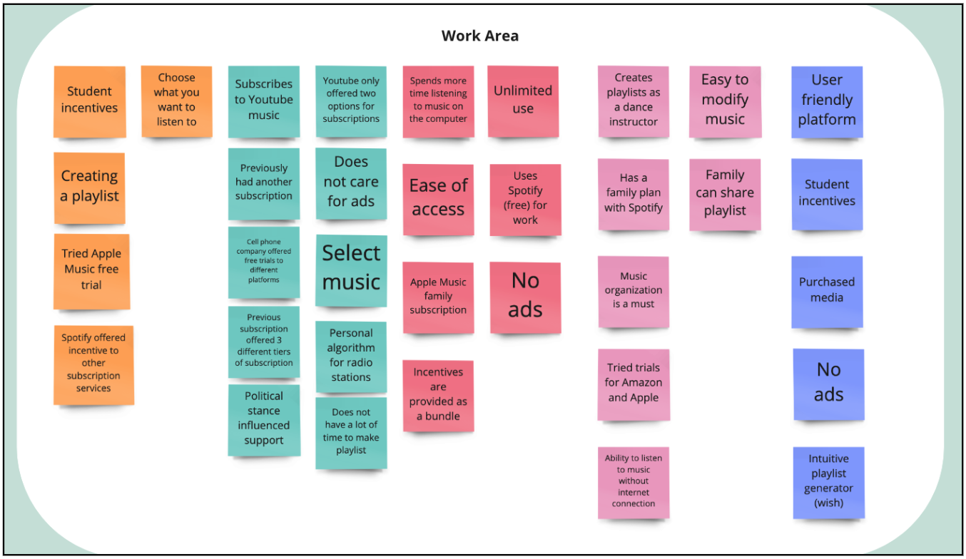
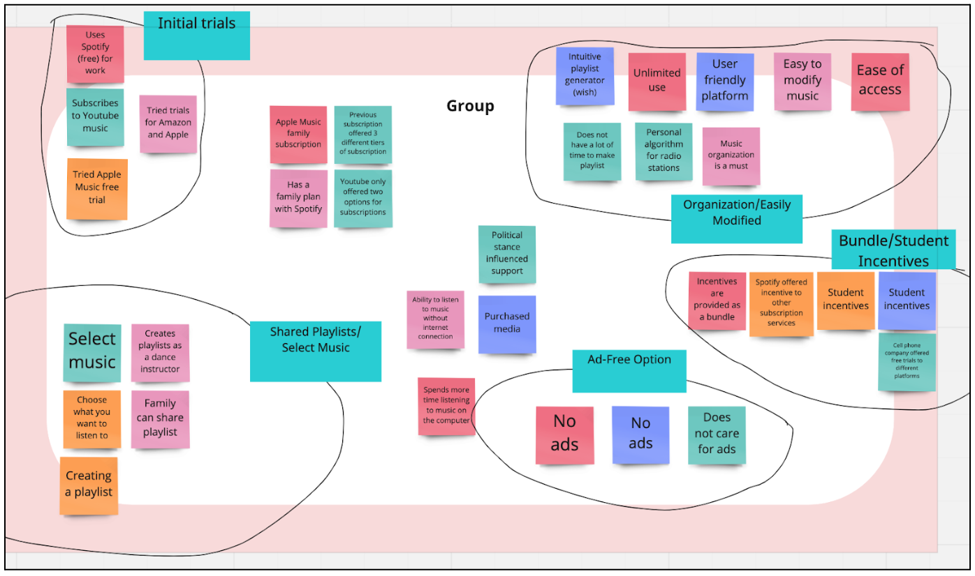
I found out what features users were not willing to live without, and what features were less important. Through affinity mapping, I was able to synthesize the data from the interviews.
Analyzing Data
When analyzing the user research, it was clear that the initial attraction to the product happened through the utilization of a free trial. Most users were offered a free trial by the product company or a partner of the company. Users were also attracted to features that would organize playlists, let you select your own music, and an ad-free experience. Ads can be a pain point for users, but I also see how ads can be used as a way to compelle users to pay for a subscription. Offering ads in the free version could persuade users into paying for the ad-free premium version.
Who Are We Designing For?
I began thinking about my own experience with my current media subscription and what were some of the top tier features I look for. I want the product to be easy to use and I want to be able to access what I want at any time. My music app is an app I use everyday. What does that look like for our current/potential users? I had to go back and understand who am I designing this product for?
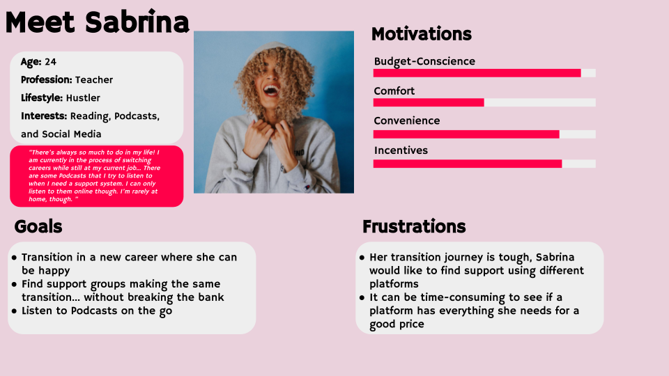
Through the observation of user interviews and the product, I was able to create three personas:
This was such an important step in this design process. The more that I paid attention to what motivates the users of our product, the more I was able to understand the pain points to avoid. Our users are on the go and need a reliable media app that involves less obstacles. Being able to upgrade to premium should be simple and persistently available to both current and new users.
Industry Leaders
I began sketching out potential solutions that would address the login/sign-up flow as well as the call-to-action feature. I wanted to make this as easy and familiar to people as possible. However, before doing so, I needed to revisit some of the Industry Leaders that have already solved similar challenges.
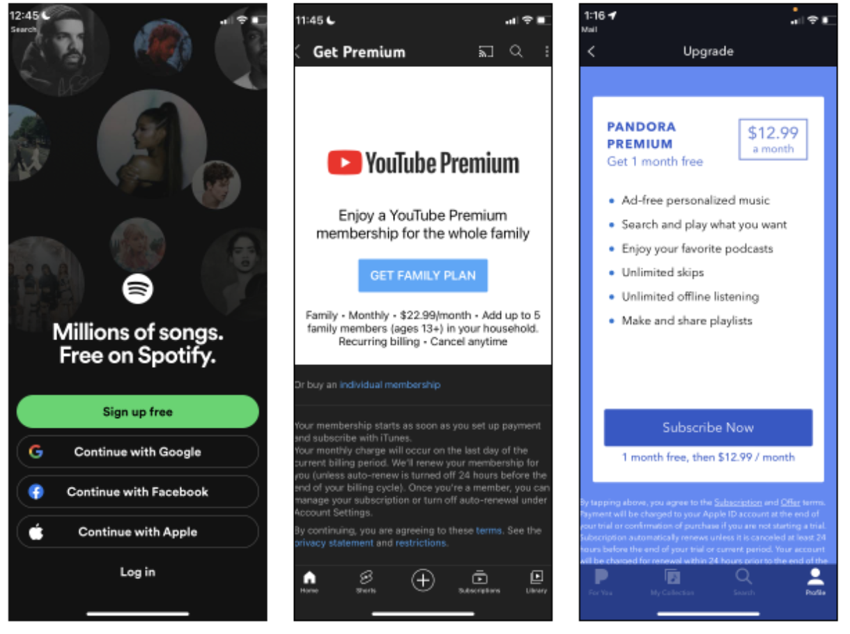
In examining Spotify, it reaffirmed that I was on the right path with making this flow easy. Both Pandora and YouTube display “subscribe now” call-to-action for subscribing to premium. The following would be useful features:
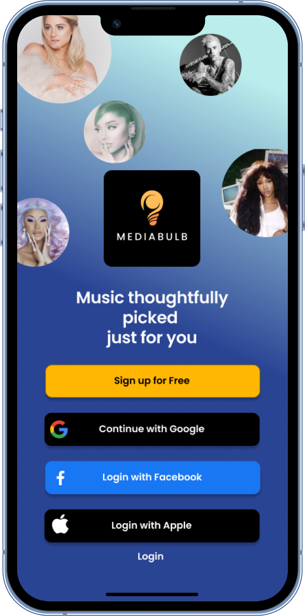
Continue with Google, Apple, Facebook- Buttons when signing up
Quick list of features included with premium with subscribe now
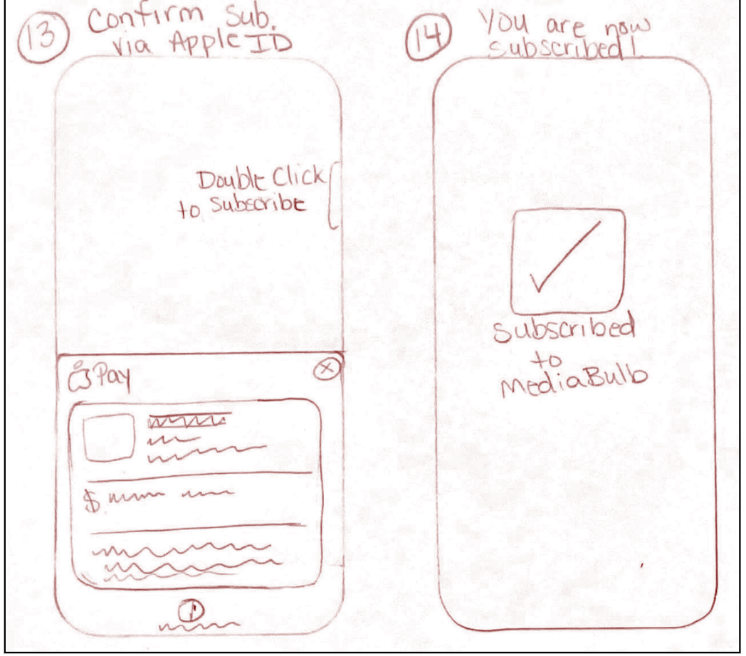
Subscribe using Apple ID
Ad-Free listening
Playlist created for you
Choose music
This exercise really helped me experience the users’ journey. I felt very comfortable making logical decisions with the data I’ve obtained. The interactions I had with some of the competitors really helped me empathize with the users that raved about the products. I literally placed myself in their seat and was able to experience what they explained to me in the interviews. This practice is a very important key in solving problems for products that come in the future.
Sketching and Storyboarding
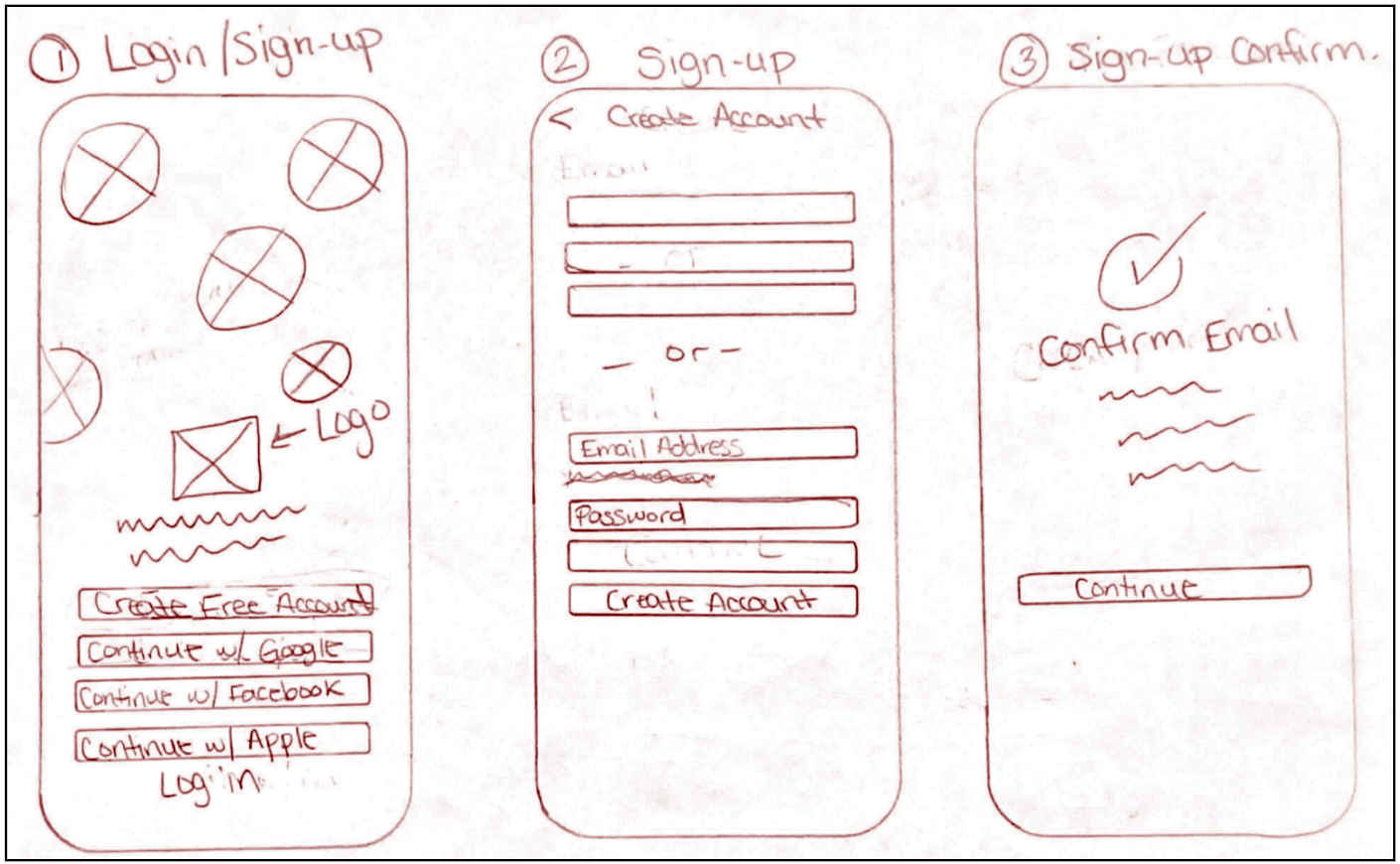
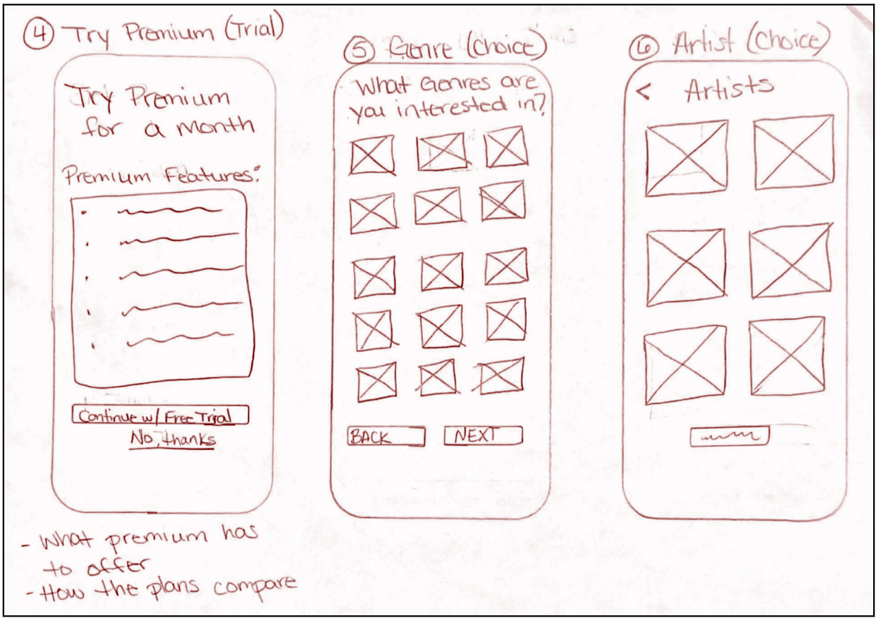
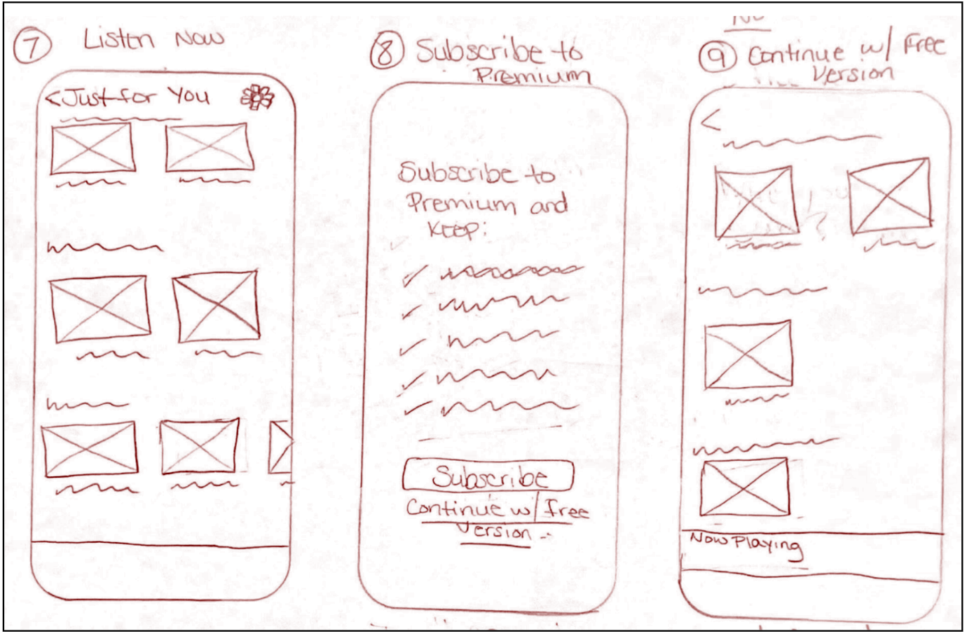
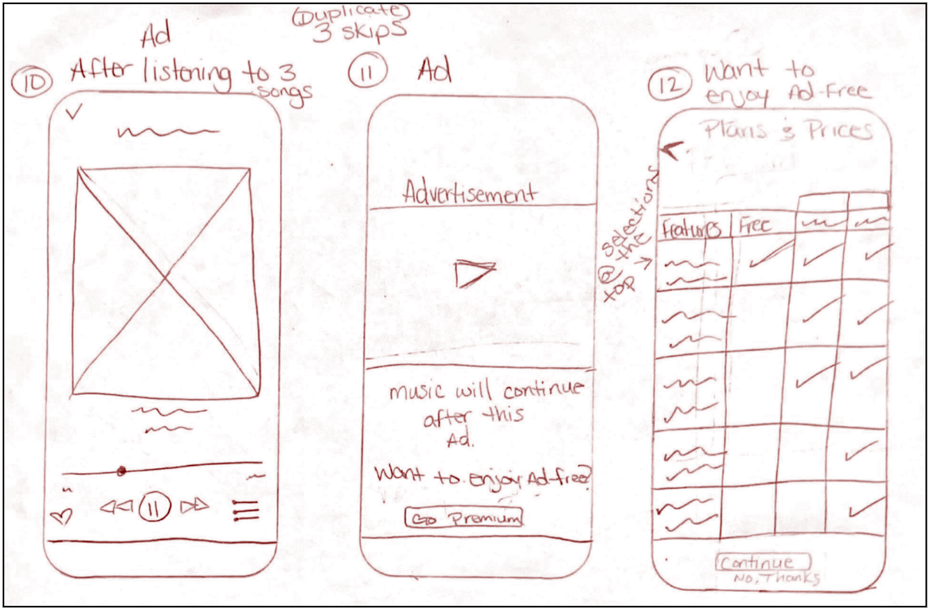
Having done some competitive research, I was able to start sketching possible solutions. Below, you will be able to view the storyboard I created as a guide to creating my High Fidelity Design (HFD).
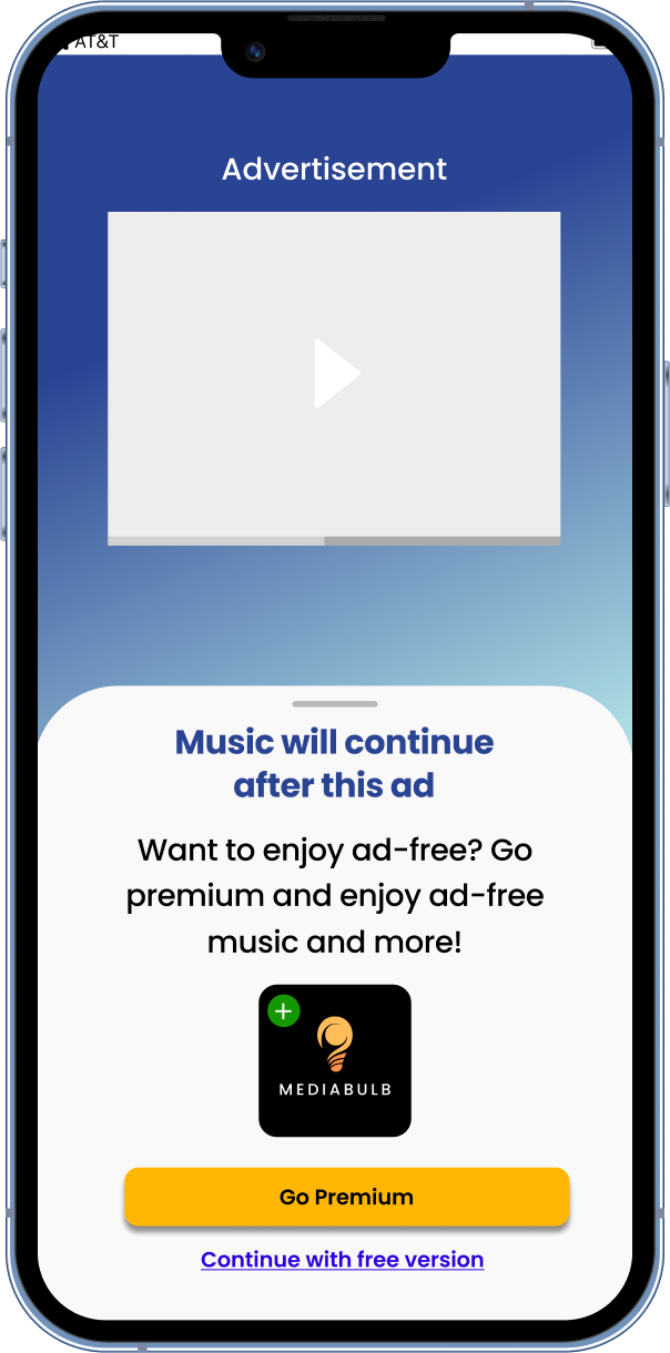
Creating this storyboard was a smooth task. My design process was greatly matched with the front loaded research. Keeping the companys’ goal in mind, I wanted to give users a compelling reason to subscribe to premium. One of the solutions crafted involved offering a free one-month trial. Users would have the opportunity to engage with the premium features. They may never want to be without the features once their trial ends. When the trial ends, there will be a prompt to continue with premium. If they do not want to subscribe, the features will revert back to the free version which has ads. It was very clear from my interviewees that ads disrupt the user experience. Ads are also an opportunity to grow other businesses. Pairing this feature with the free version and eliminating it from the paid version, will attract users to subscribe to premium.
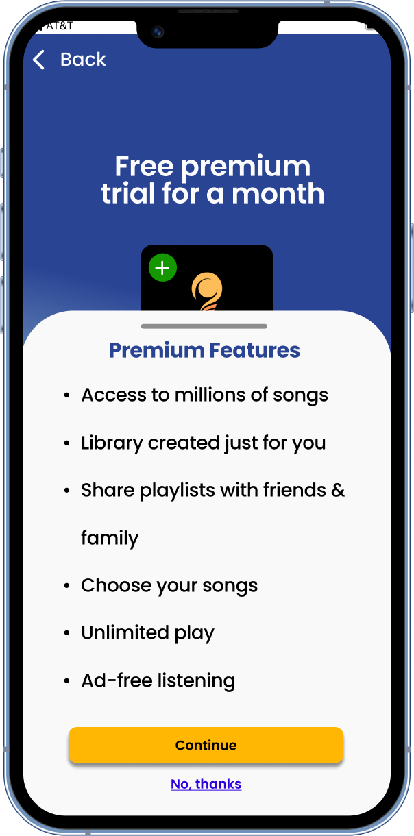
Premium subscription features will include:
Unlimited Play
Ad-Free Listening
Library Created Just For You
Choose Your Music
Share Playlist
Access to Millions of Songs
With this design in hand, I was ready to create a real MVP (Minimum Viable Product) prototype which I would be able to test with users.
Prototyping and Validation
This prototyping process was straightforward due to all the previous planning. I made sure to follow Apple’s Human Interface Guidelines to ensure it would fit platform guidelines.
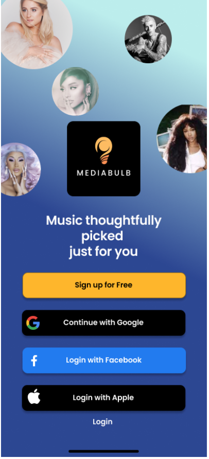
Login/Signup screen
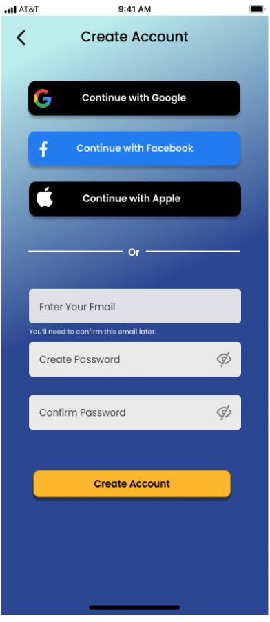
Create account using other accounts from Gmail, Facebook, and Apple
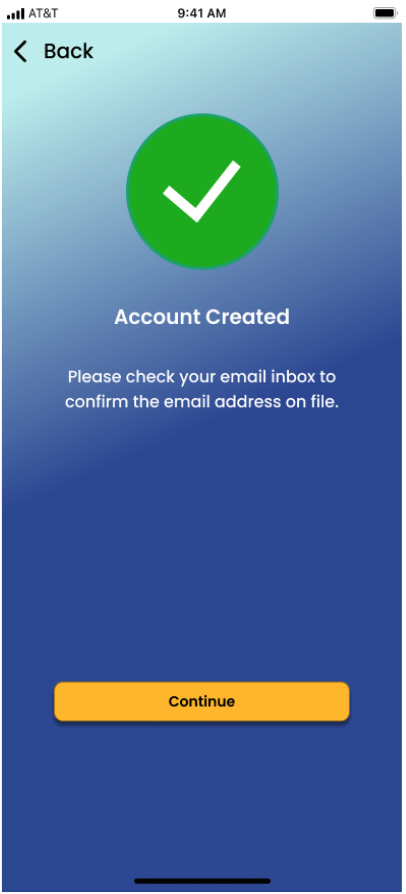
Account successfully created
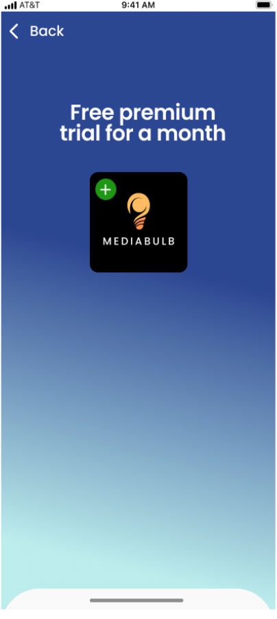
Free premium trial

Premium features
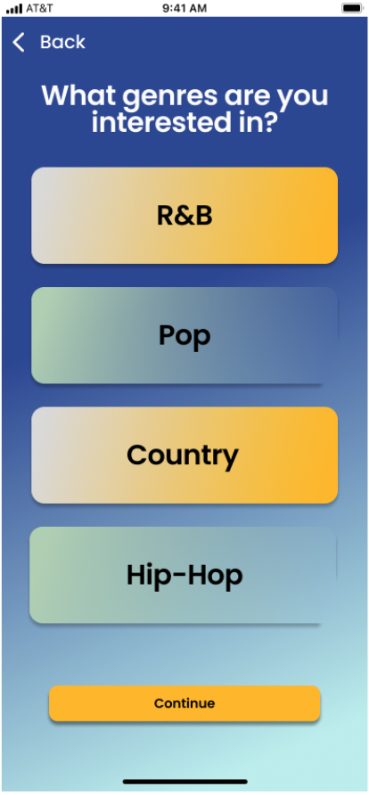
Music genre preference
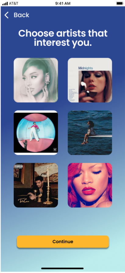
Artist preference

Listen to music based off of preferences selected
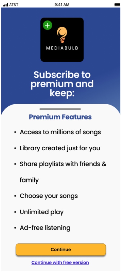
Subscribe to premium after trial expiration
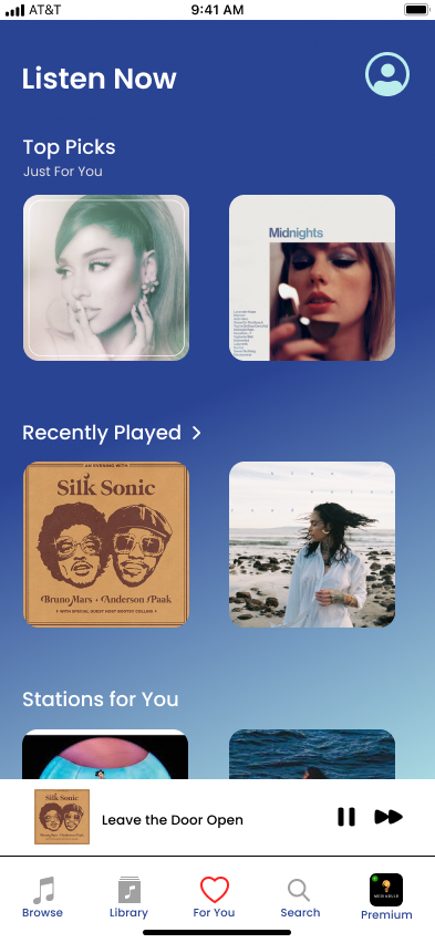
Continue with free subscription
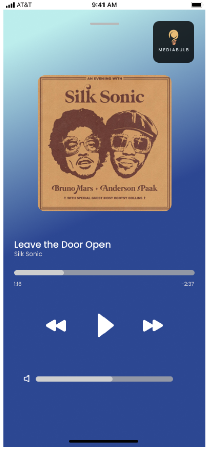
Listening to music
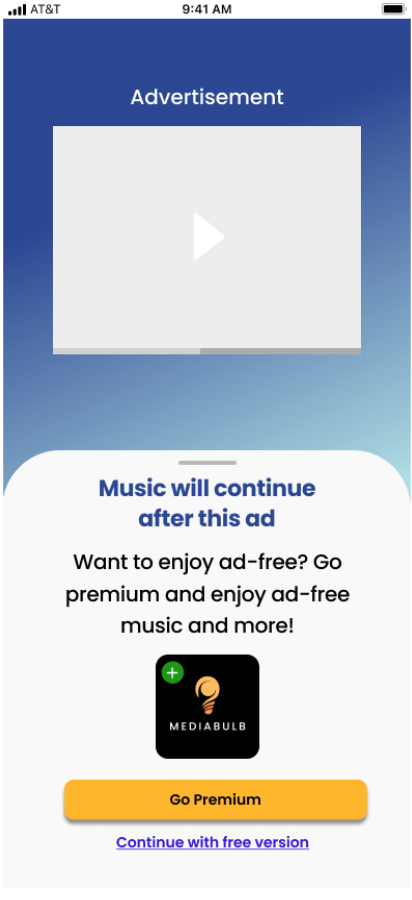
Advertisement
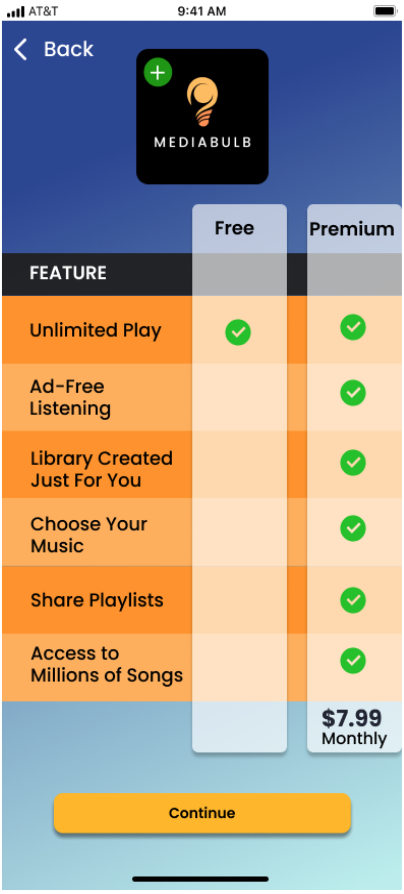
Features of both free and premium subscriptions
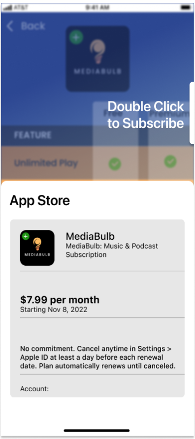
Confirmation of subscription

You are now subscribed
Validation
With my completed prototype, I was ready to validate the design and see if it met the needs of users and company, and also where it could be improved further.
To do this, I recruited five participants with the following characteristics:
Age range: 19-24 years old
Own a smartphone
Has current media subscription or thinking about purchasing one
During interviews like this, it is always interesting to see how people are ready for the actual finished product once they are a part of some of the decision-making. Overall, the participants had a positive experience with the product. One participant really found it very clever to use ads. “I think it’s very clever that you have ads. I don’t like ads because I don’t want my music to stop.” stated one of the participants. Suggestions of adding artist videos and allowing users to update music preferences at will.
Although all of the participants stated that this was a useful and informative design, the feedback I received was still very helpful for future design improvements. For example:
One of the participants mentioned that the like/button was not as noticeable as it should've been.
Another participant said that having different premium tiers would also be a way to offer multiple opportunities for a free trial
Conclusion
Overall, this design was a success and a valuable learning experience. I was able to successfully produce a prototype that was well received by all of the participants. They found the design to be easy and very clear to navigate. This design was able to match well with user needs and company goals. Valuable feedback was also received that will be able to aid MediaBulb in future iterations.


