UX DESIGN. ECOMMERCE
Kala Seller Dashboard Design
Redesigning the seller experience
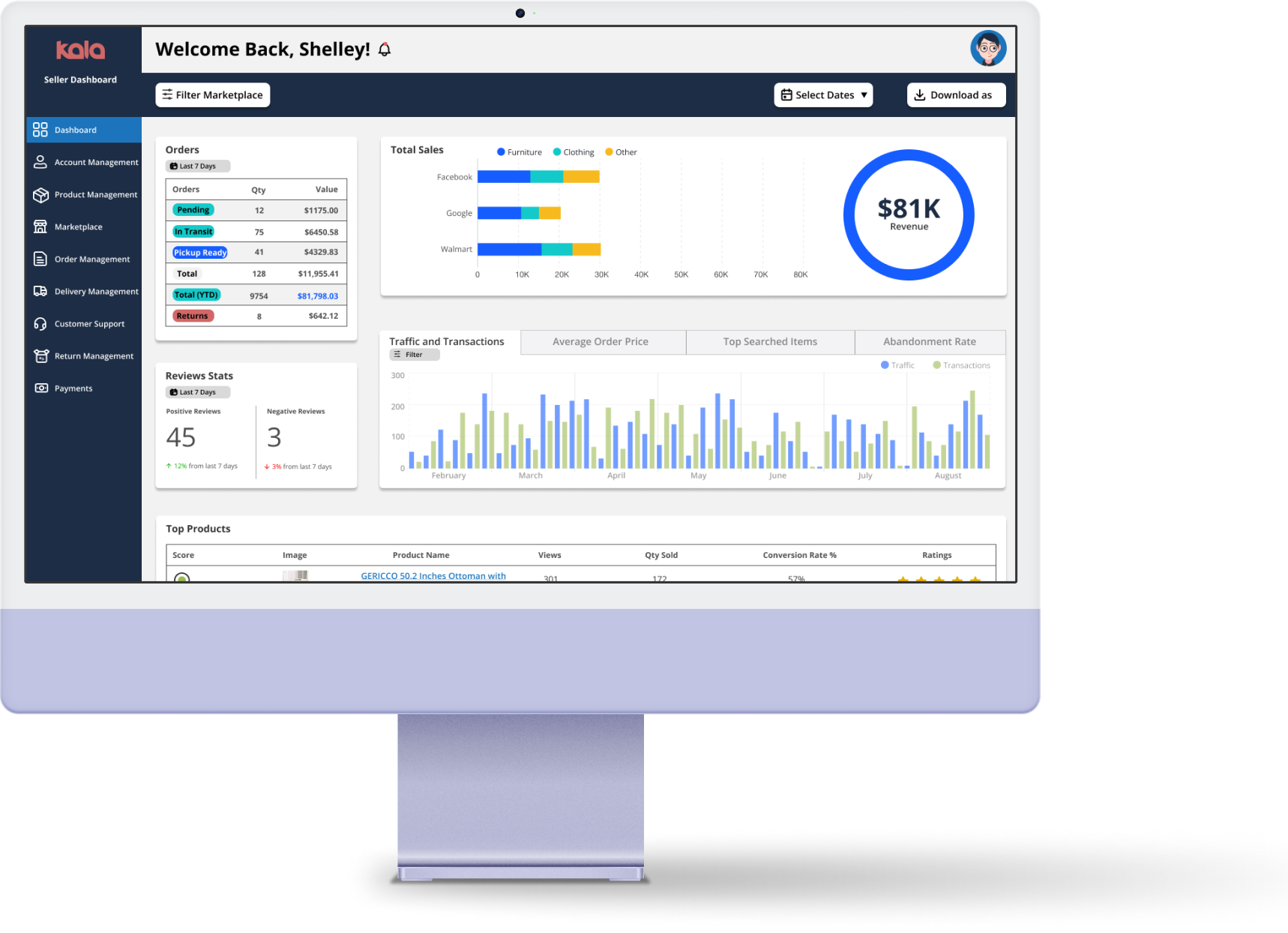
About Kala
Kala powers online marketplaces & brand sites to sell products from local retailers, getting products to shoppers faster with Buy Online, Pickup In-Store (BOPIS) or fast local delivery.
Project Overview
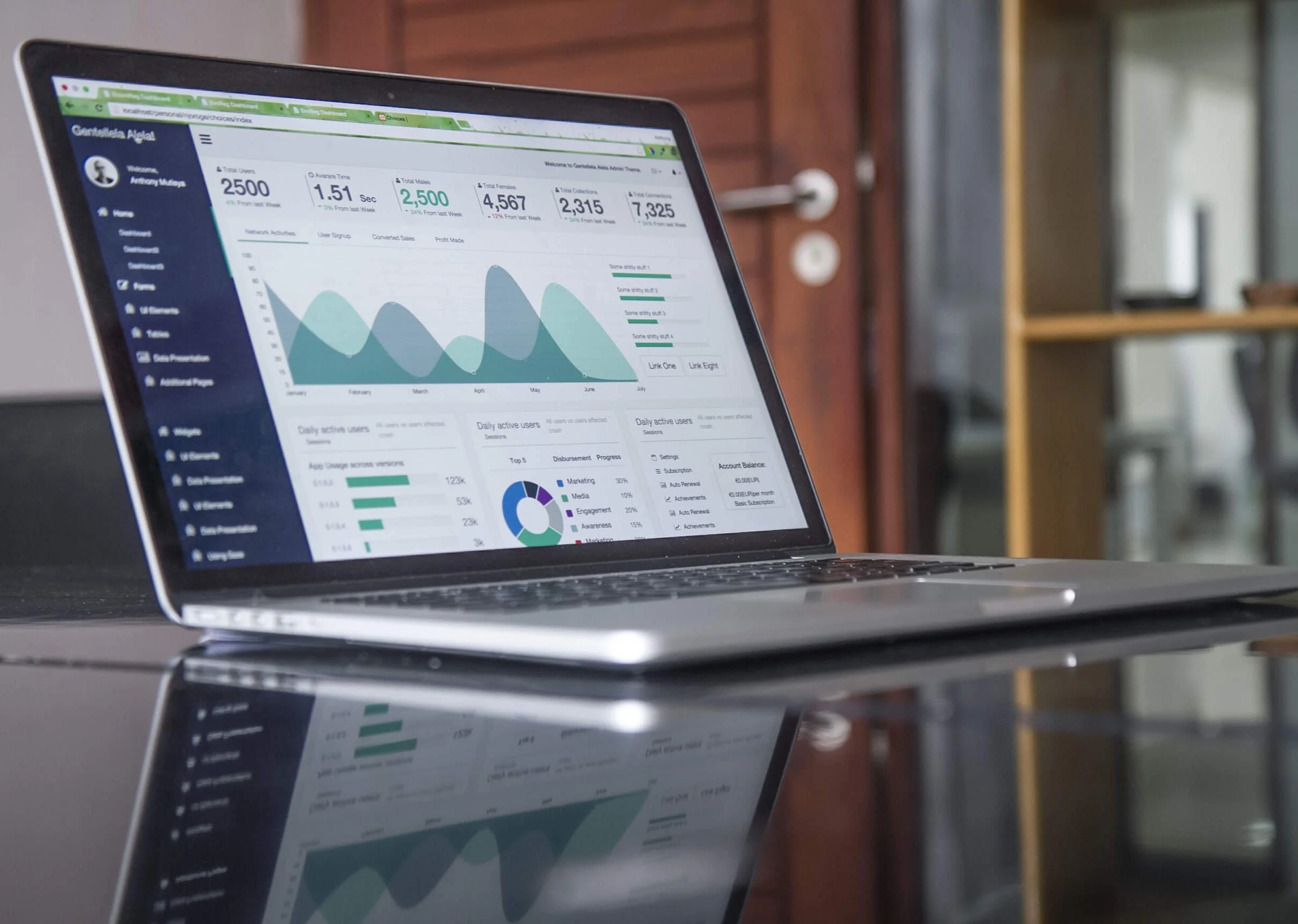
After halting their launch for seven years, Kala wanted to hone in on what their company offers for sellers. Most eCommerce marketplaces don’t support local shopping capabilities, and don’t offer BOPIS: Consumers can’t shop the way they want (on marketplaces) or get their orders the way they want (BOPIS or fast local delivery). Kala wanted our team to redesign their current seller dashboard. They felt that their screens were out-of-date with companies that offer similar products.
Working with a team of four, we divided the priority screens and flows. As we worked through the planning stages of this project, a huge hurdle that presented itself was the lack of potential users for usability testing. We had to improvise our research methodologies. Ultimately, we relied on our stakeholders feedback, competitor analysis, and a/b testing as a way to empathize with their future users.
Solution
During this Industrial Design Project (IDP), I was tasked with redesigning a more user-friendly seller dashboard with enhanced functionality and user-based hierarchy. A big part of this functionality included BOPIS management, which was lacking in their original design. This feature would hold true to their eCommerce marketplace solution that supports local businesses. Kala is a start-up company that was founded in 2017. Though the pandemic placed halts on the full launch of their platform, they were now ready to make improvements to their current designs with the user experience in mind. After completing a competitors’ analysis and some informal a/b testing sessions, I was able to create a seller dashboard with a more modern feel and updated functionality.
Problem
Working with a team of four, we divided the priority screens and flows. As we worked through the planning stages of this project, a huge hurdle that presented itself was the lack of potential users for usability testing. We had to improvise our research methodologies. We ultimately relied on our stakeholders feedback, competitor analysis, and a/b testing.
Research
After our first stakeholder meeting, we were given their original designs and some screens for inspiration. Here are the goals Kala has set for this current project:
An updated, comprehensive design to be included in their investor deck and serve as a guide to developers.
A design that incorporates all of the components that make the tool intuitive and user friendly.
I studied some seller dashboard designs from companies that was shared by the stakeholders at Kala. Through a comparative analysis, I was able to sketch some potential designs using the crazy 8s method. My team scheduled weekly checkpoints where we would present our designs to the stakeholders of Kala and use the feedback given, to make necessary changes to our designs. Once we created our High Fidelity Designs, I conducted some impromptu a/b testing with some small business owners. The feedback that I received from the testing, helped me find some blindspots in my design and reassured me that the product was in fact familiar and easy to use.
Competitive Analysis
As our team brainstormed appropriate ways to come up with solutions to solve Kala’s problem, we started out with conducting a competitive analysis of companies that offer similar products. Shopify, Tableau, Ricochet, and Etsy were the platforms I chose to view along with stakeholder approval. After going over Kala’s original design, I was able to make adjustments based on the goals for how Kala wanted its’ potential users to interact with their product.
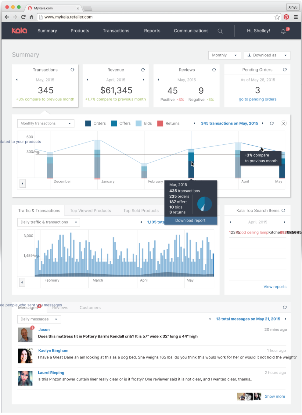
Kala’s Current Design: Banks off of it’s eye-catching charts and easy-to-read graph keys. A top menu is present for easy navigation.
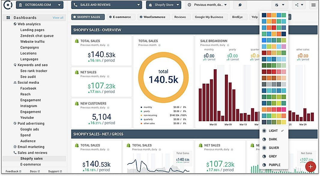
Shopify’s Design: Shopify provides a highly visual dashboard to help sellers manage their online business. It includes a range of analytics and insights, including sales trends. The dashboard can also be customized.
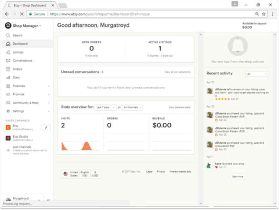
Etsy’s Design: Etsy provides a highly visual dashboard to help sellers manage their online business. It includes a range of analytics and insights, including sales trends and performance metrics. It also offers tools to help sellers promote their products and reach their target audience.

Tableau’s Design: Tableau provides a solution for sellers looking for a comprehensive and powerful data visualization tool. It provides a drag-and-drop interface that allows users to quickly and easily create interactive visualizations.

Ricochet’s Design: Ricochet is a powerful data visualization and analytics platform that enables users to quickly and easily analyze and report on their data. Ricochet also offers a range of advanced features such as real-time analytics, automated insights, and advanced filtering capabilities.
Through this exercise, I was able to get an idea of what Kala’s new dashboard would look like. Conducting a crazy 8’s exercise would be my next step in getting my ideas sketched out.
Crazy 8’s Exercise
With this exercise, I was able to bridge what Kala wanted as well as what would be helpful for their product users. I was able to take different elements from this exercise and transferred it into a “final” sketch to present to stakeholders. The side menu was a consistent element I used in the sketches. This went into the presentation sketch, along with a product ranking element at the bottom of the screen.
Seller Dashboard Crazy 8s Activity: Completed activity with attention to the visual hierarchy presented in the shared designs from stakeholders. This required further research into the variations of the product on the companies platforms
Solution Sketches

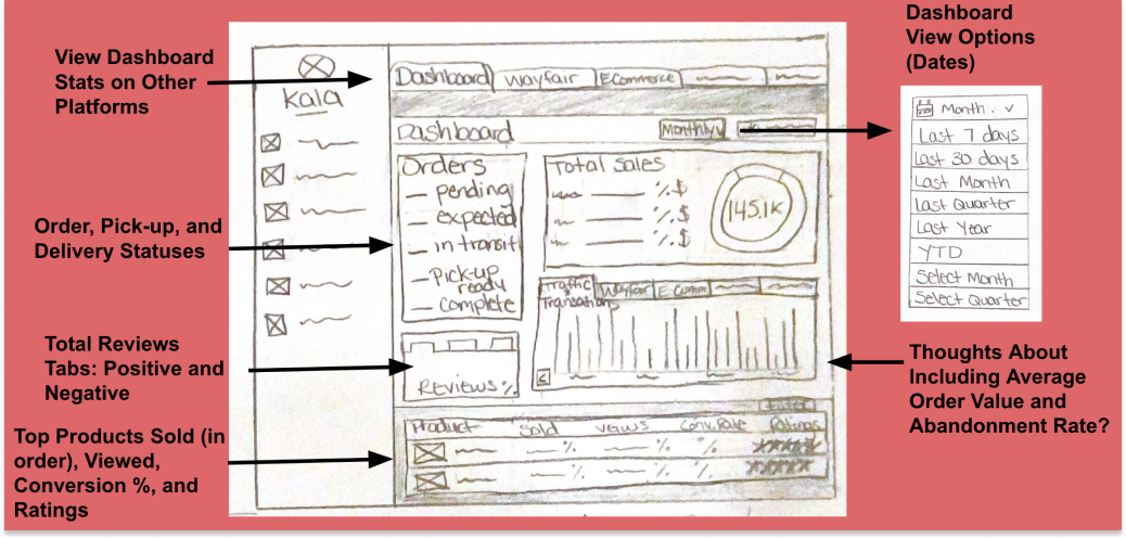
While working on this sketch, I really relied on getting insights on the design by close friends who were small business owners. Something that came up in conversation, was abandonment rate and average order value. I thought this would be a good addition to Kala’s design. We were given a document with the requirements for the seller dashboard and what needed to be included. Once I presented this design, the stakeholders like the idea of the addition. They wanted to eliminate the marketplace tabs at the top and make it into a button. Everything else on the screen was fine to develop in the low fidelity design mockup.
Low Fidelity Design
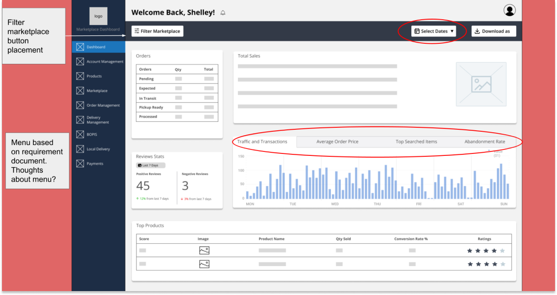
I was able to use Kala’s current style guide to get a feel of how th design would start to look. While creating this design, With my counterparts creating different parts of the seller dashboard, we had to ensure that our left side menu looked the same. The feedback from the stakeholders was positive and I was able to proceed with the high fidelity design mockup.
High Fidelity Design
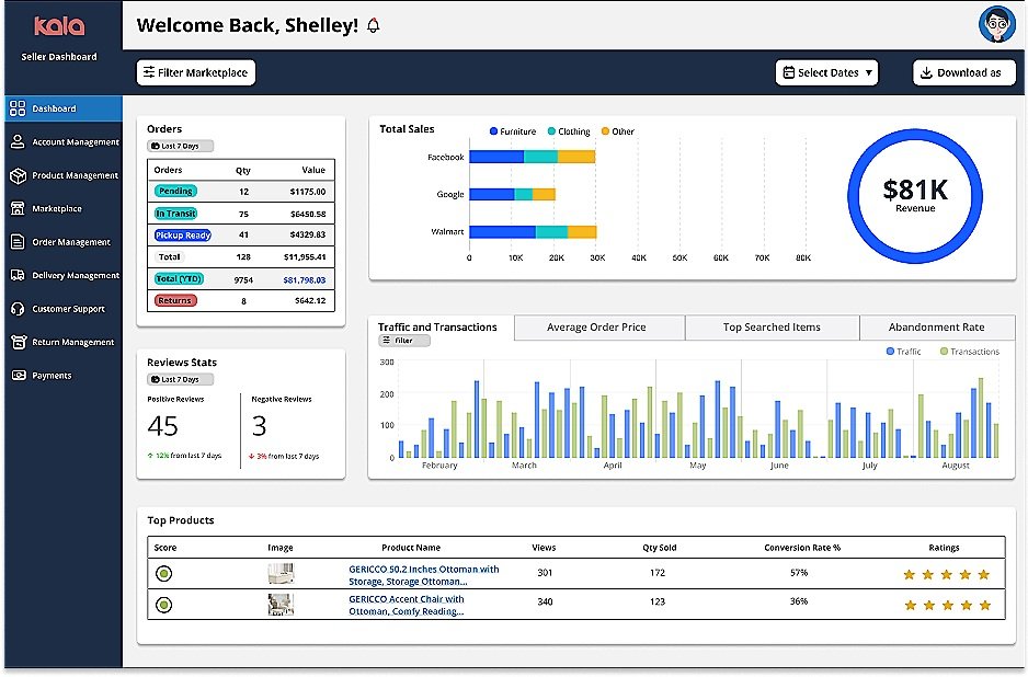
After completing an a/b testing session with some small business owners, I noticed that I needed to be mindful of the visual hierarchy in the order section. One of the business owners, mentioned how the first section she would visit would be the orders section. She would need to be able to prepare for her upcoming orders. I decided to add a color indicator to the orders section to help users quickly distinguish between the difference indicators. Checking her inventory of products would be her next stop. Viewing her revenue would follow last.
View my teams’ final deliverables.
Conclusion
Overall, this design was a success and a valuable learning experience. I was able to successfully produce a design that met the needs of the stakeholders. The feedback I received during a/b testing was very valuable for future iterations.
This project gave me the experience of working with a team and solidified the importance of regular collaboration. Our designs ultimately flowed well because we made sure to regularly review each others designs. Once we noticed something that would impact the groups’ design, we asked each other questions and brought attention to how it would impact other screen.
Through this exercise, I was able to get an idea of what Kala’s new dashboard would look like. Conducting a crazy 8’s exercise would be my next step in getting my ideas sketched out.
Crazy 8’s Exercise
With this exercise, I was able to bridge what Kala wanted as well as what would be helpful for their product users. I was able to take different elements from this exercise and transferred it into a “final” sketch to present to stakeholders. The side menu was a consistent element I used in the sketches. This went into the presentation sketch, along with a product ranking element at the bottom of the screen.
Seller Dashboard Crazy 8s Activity: Completed activity with attention to the visual hierarchy presented in the shared designs from stakeholders. This required further research into the variations of the product on the companies platforms
Solution Sketches

While working on this sketch, I really relied on getting insights on the design by close friends who were small business owners. Something that came up in conversation, was abandonment rate and average order value. I thought this would be a good addition to Kala’s design. We were given a document with the requirements for the seller dashboard and what needed to be included. Once I presented this design, the stakeholders like the idea of the addition. They wanted to eliminate the marketplace tabs at the top and make it into a button. Everything else on the screen was fine to develop in the low fidelity design mockup.

Low Fidelity Design
I was able to use Kala’s current style guide to get a feel of how th design would start to look. While creating this design, With my counterparts creating different parts of the seller dashboard, we had to ensure that our left side menu looked the same. The feedback from the stakeholders was positive and I was able to proceed with the high fidelity design mockup.

High Fidelity Design
After completing an a/b testing session with some small business owners, I noticed that I needed to be mindful of the visual hierarchy in the order section. One of the business owners, mentioned how the first section she would visit would be the orders section. She would need to be able to prepare for her upcoming orders. I decided to add a color indicator to the orders section to help users quickly distinguish between the difference indicators. Checking her inventory of products would be her next stop. Viewing her revenue would follow last.

View my teams’ final deliverables.
Conclusion
Overall, this design was a success and a valuable learning experience. I was able to successfully produce a design that met the needs of the stakeholders. The feedback I received during a/b testing was very valuable for future iterations.
This project gave me the experience of working with a team and solidified the importance of regular collaboration. Our designs ultimately flowed well because we made sure to regularly review each others designs. Once we noticed something that would impact the groups’ design, we asked each other questions and brought attention to how it would impact other screen.